Max Map


A product that facilitates the accessible features of digital maps for the visually impaired.
.png)
Introduction
Maps are visual representations of the physical world around us. With the emphasis on maps being “visual” representations, issues of accessibility naturally come up for individuals who have visual impairment. Although some advanced features − such as voice assistants and haptic features − have been applied in the development of digital maps, the visually impaired still face various challenges when navigating.

Hence, there is a need to consider the user-centered design of digital maps to improve the digital map’s usability for people with visual impairments.
To better define the problem space and identify the user pain points, we conducted our research with a series of research questions.
Mental Model
What are people with low vision’s general understanding of maps?
Information needs
What essential information does the digital map provide to users with low vision?
Navigating Habits
How do people with low vision usually navigate places with or without maps?
Existing Features
How do the existing features interact (give direction, give live feedback, use an additional feature, etc.) with the user as they navigate
Map Usage
If people with low vision use digital maps, which ones do they use, and how do they interact with it when navigating places?
Help from maps
How do digital maps help people with low vision before and during their journey.
Literature review
In order to make further research decisions, we first conducted the literature review to define our problem space and narrow down our project scale. Our findings are as follows:
Existing Systems

Hybrid Interactive Maps

Haptic Feedback

Sonification

3D Printed Maps

Vibroacoustics

Mixed Reality
Role - playing While Think Aloud
Before we moved on to recruit users and set information goals for interviews, we decided to generate empathy and understand our users more through role-playing.
After we conducted role-playing, each of us created an empathy map to present and analyze the data collected.
Semi-Structured Interview
After role-playing, we had a clearer idea of what concepts to focus on. To confirm and expand on these concepts, we interviewed a total of 13 participants that we gathered through various approaches, for example, through local senior centers, personal networking, etc
 team on the way to the senior center |  inside the senior center |  team conducting interveiws with the seniors |
|---|---|---|
 team doing affinity notes after interviews |
After our interviews, we did affinity mapping together.

We generated some user personas based on the pattern we found in interviews:
Survey
We chose survey as our final research method for two reasons. The first reason is that a survey could back up and supplement the information gained from our other research methods. The second reason is to obtain data from a wider net of responses in hope of matching the survey finding to the patterns found in interviews and role-playing.
Based on the survey finding, Google Maps and Apple Maps are mostly used by people with low vision. The nature of this question asking which digital maps they use was multiple-choice; thus, we could see the pattern that people, except for two who indicated that they didn’t use digital maps, use various maps interchangeably. Waze is the navigation app mainly used for driving purposes. Other maps mentioned by the few participants were Adriadne GPS, Nearby Explorer online, and Soundscape.
When asked about the most regularly used visual aids (Graph 4), the respondents who have low vision mostly used Screen Reader. Both White Cane and Digital Maps are also widely used across the respondents.
In the survey, we had the “Other” option, where the respondents listed the following aids they use:
Apple phone with assistive features on, Handheld video magnifier,
Monocular, and low-vision reading glasses. As expected from the finding to the previous question, no one actively used any aids that use braille.
Voice Assistant, including Google Assistant, Siri, or any voice guide on digital maps, that is controlled by voice commands is the most used accessibility feature according to the survey found. Color Inversion and High Contrast were used by the respondents who also have “color blindness” which does not fall under the characteristics of the target user group for this project.
The overall finding suggests that voice assistant and screen reader that can communicate with users through audio is the preferred assistive technology that users with low vision mostly use.
More than half, around 55%, of the respondents indicated preplanning before navigating places is very important for them. Because the questions were asked in the Likert form, the finding
could suggest that pre-planning the route is the crucial step to facilitate the navigation process for the low-vision people. Also, zero response from the “I don’t pre-plan my routes” option could imply that the pre-planning route is perhaps the mandatory process for people with low vision to navigate any place.


The survey finding suggests that the top priorities for users to know when going around places are information about the surroundings (findings from the interviews) – such as:
● “Physical obstacles”
● “Information about buildings (not your destination) around you”
● “Notification of current positions”
● “Location of crosswalks and sidewalks”
This additional information provided by the respondents does fall under the theme of the findings in the interviews. Overall, the findings gave us insight into understanding the process users go through and the information they seek when navigating places.
Findings from Research
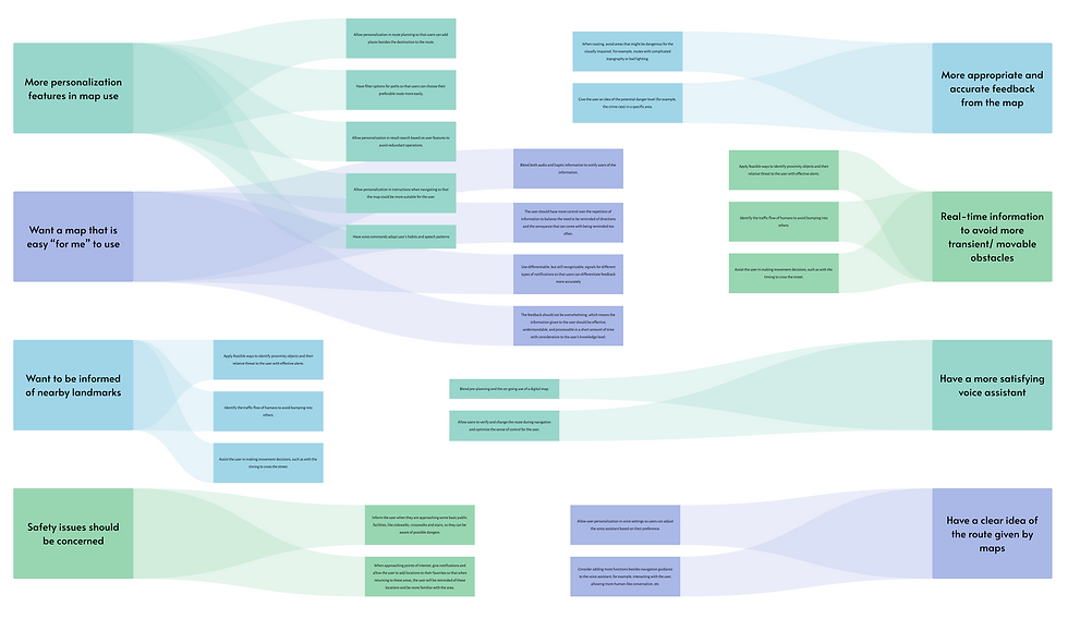
After analyzing the results from the research, we identified four overarching pain points that ran through the findings for all the methods.
1. Voice Assistant in existing maps and how it gives users feedback and interacts with users are distracting and not helpful.
2. Pre-planning is significant for people with low vision, but most maps don’t support the feature.
3. Users need more appropriate information about their surroundings.
4. Sociotechnical context should be considered.
User Needs and Design Implications
.png)
Ideation
Before sketching out our design's primary features, the team conducted a brainstorming exercise called brainwriting. We followed the basic protocol of brainwriting, which is a 4-3-5 process. We first identified four key issues we wanted to further ideate on for our solutions. That way, we got ideas that targeted each major pain point, and each member of the team contributed at least three ideas to that aspect of the problem space. Having four issues written on each sheet in a shared excel file, each group member quickly jotted down at least three ideas – including new ideas or added to others' ideas – within five minutes for the given issue. Then, we "passed along" the sheet to the other member of the team who did the same. At the end of the brainwriting exercise, we gathered roughly 20-30 different ideas for our solutions. We then discussed all ideas and voted for our top three to five ideas in each focus, and tallied the votes to come up with our top four ideas in total.
Sketched Concepts
The primary design ideas we extracted from our ideation process are the following:
Analysis and Ideation
Design and Evaluation
In order to make the product better address the user needs, we extensively involved users in our design process by conducting 4 rounds of design and evaluation sessions and iterating our prototype accordingly.
Round 1 - Wizard of OZ
For our first feedback sessions, we interviewed 2 participants (both identified as visually impaired) with the goal of understanding if they were receptive to our design ideas and if they understood the benefits it provided.
We did Wizard of OZ to quickly decide which features were important to develop and which were not.
In preparation, each team member picked one of the design concepts and wrote down questions to be asked during the feedback sessions that aligned with our goals for this round. Scenarios were made for the first three concepts in order to gauge the participants’ interactions and impressions with the concepts in context.
Our users want more control, personalization, and customization within the map. They also want a small learning curve, more detailed information, and a minimal cognitive load while using it. The feedback session with our participant brought to our attention a flaw in our design and hence we decided to drop the idea as we proceeded ahead with our wireframes. We also worked towards including all the design implications we had realized from our feedback sessions into the design of our wireframe for the remaining 3 design concepts we had.
The wireframe is split into 3 parts in the form of call flows, with each part covering one of the 3 remaining concepts we decided to continue with.
Round 2 - Wireframing
From the findings associated with feedback for our wireframe, we can see that the biggest issues are related to the presentation of information and system recovery from errors ( errors in this case mainly, but not exclusively, refer to when the user interacts with the system in an unanticipated way, such as incorrect voice commands where the system is not able to provide an appropriate response). In regards to sound labeling and crowdsourcing, the recovery from errors can be addressed by adopting a learning curve for users to understand how to appropriately interact with the system. Users need to be taught the different types of sound labels and digital pins available to them as well as a simple and efficient way to differentiate between them.
For the visually impaired, the visual elements shown should be concise and convey the most important information, serving as supplements for the audio information. Therefore, for the low-fidelity prototype, we magnified the font size and minimized the visual complication of each screen.
Round 3 - Low-Fidelity Prototype
Issues surrounding our design concepts could be grouped into two categories: the presentation of information and system recovery from errors. These issues mainly deal with the interaction with the Voice Assistant (VA). Therefore, at a medium-to-high level of fidelity, this prototype looks to focus on creating an efficient and suitable interaction between the user and the VA.
Round 4 - Functinal Prototype
These call flows are designed and executed separately for each of the three design features: a customizable VA (personalization survey), sound labels, and crowdsourced pin feedback. These features will be supplementary to an existing map, but for now, we will have a placeholder map to refer to in the call flows we call MaxMap, which subsequently became the official name of our product.
Although designed separately, each feature should be considered part of a whole product; one example is that the survey personalizes the pins and the created pins identify the landmarks for sound labels to attach to.


